The surgery scheduling module was the largest part of the product and used by 90% of our users. Our goal was to rethink how surgery scheduling could work even during a pandemic.
Role
Senior Product Designer
Timeline and contribution
This case study presents features I was fortunate to be responsible for designing from Dec 2019 - August 2020. My day-to-day job included user research, prototyping, interface design, documentation, and design QA. I worked in close collaboration with PMs, engineers, and various stakeholders to bring this project to life.
Problem space
I had initially designed early versions of our product since I started working at LeanTaaS when there was only one customer. The early features included scheduling into what was called “Open Time” which was a concept our team came up with to allow surgeons to release the time they don’t need and put it into an “Open Time” market for others to use. Our goal was to allow for schedulers to fill out digital case forms to then attach to their requests for time. Our challenge was to accomplish this during the peak of the COVID pandemic which impacted all hospitals across the country.
Outcome
The redesigned version of the surgery scheduling part of our product helped retain more than 75% of our customer base when most had planned to cancel their contracts during the peak of COVID. The scheduling module is used by over 160 hospitals across the country and includes 4 of the nation’s largest health systems. Some other positive side effects included changing the status quo of how schedulers worked. Many schedulers were enabled to work remotely from the safety of their home.

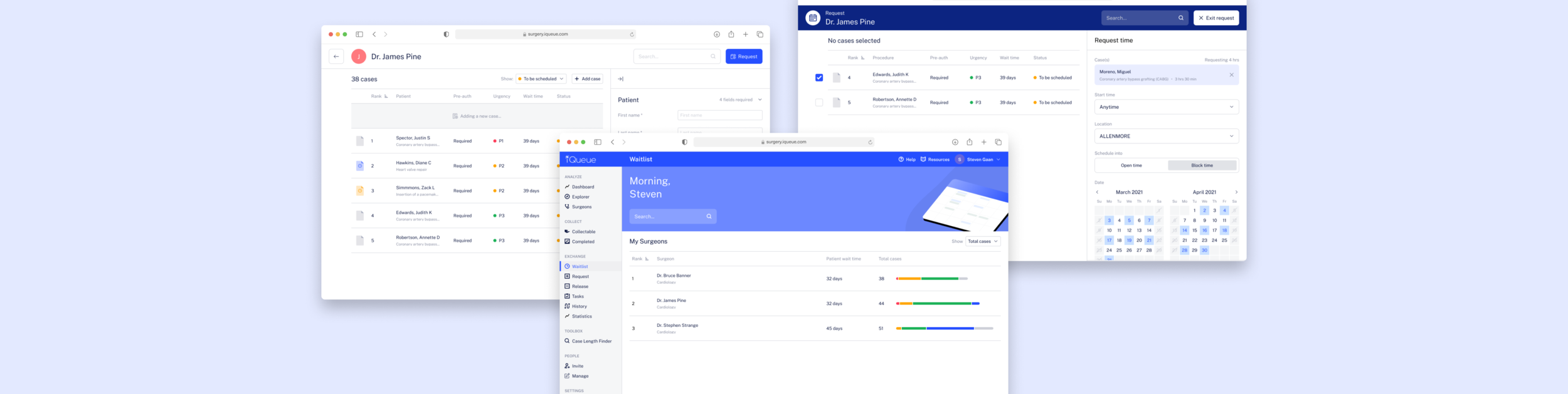
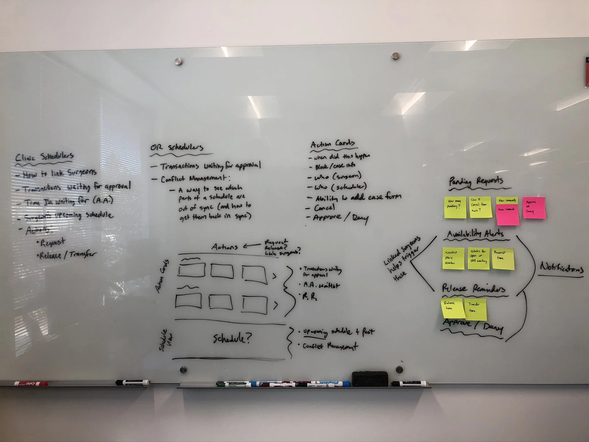
Waitlist
We came up with a way to help schedulers gain transparency into how many cases each of their surgeons had in their backlog. This was a crucial adjustment since the COVID-19 pandemic forced hospitals to reschedule many of their elective surgeries. On top of that, most hospitals had no system for prioritizing their cases efficiently once they were allowed to reopen elective cases. We provided them with a simple way to not only see how many cases each surgeon had, but also a way to see the breakdown of different priority levels.

Case List + Schedule
Each surgeon was given a new way to see their list of cases they had yet to perform and what priority each fell under. Priority here is synonymous with urgency which depended on things like the health of the patient and the severity of the surgery. The schedule on the right, enabled schedulers to see when their surgeons had block time and if those blocks were full or available.

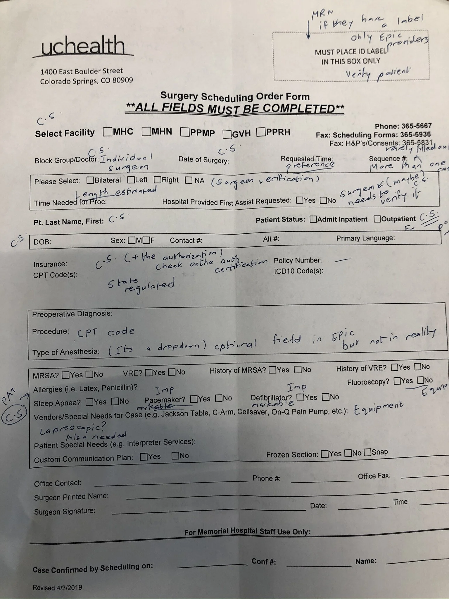
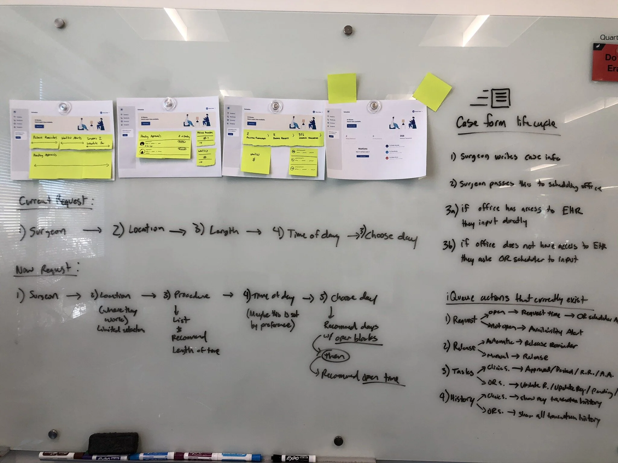
Digital Case Forms
Most hospitals have paper case forms. This was a massive feature that looks simpler than it was to implement. Making a digital case form took months of research of how each hospital structured their paper forms. We also had never before handled PHI so we needed to do the right security upgrades to our company as a whole to certify ourselves to handle PHI data.
Adding a case
It was important to bake in interactions like this to help the user understand when something was being added to the request form from the case depot.

Requesting Time
This flow was a way for schedulers to attach cases to a request. A request is a way for schedulers to ask for the time they want which gets approved by OR Schedulers at the hospital. OR Schedulers would normally handle many of the logistics that go into scheduling surgeries. This new way to ask for time allowed schedulers to clearly see when time was available before asking for it which greatly reduced the back and forth they would normally have over the phone.

Design System
This was a 6 month project that included multiple versions of every asset we made. Aside from the icons, I drew the illustrations myself and came up with an easy-to-reuse system so that we could better scale our product. The illustrations were an important part of adding some life to the flows since we learned that our schedulers really loved when we included them.
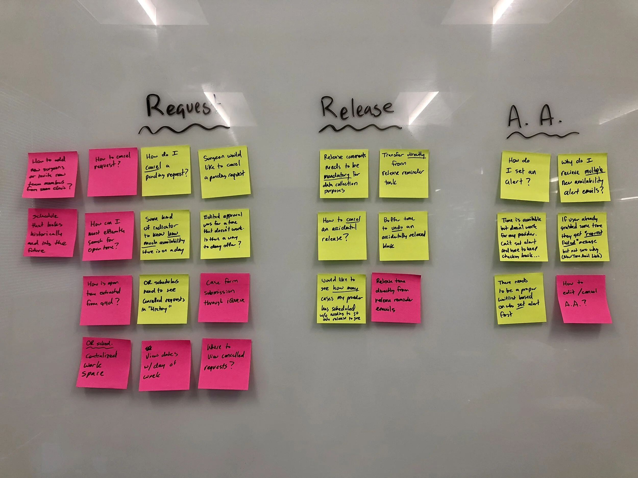
Process
The following is a quick view into what our process looked like when developing this product. It included on-site research of our customers to build empathy for their work life and their process, collecting evidence of current process problems and brainstorm/testing workshops with internal/external stakeholders. I’m happy to discuss deeper details of this.

Early home page
This is what the scheduler’s home page looked like prior to the COVID pandemic. This version prioritized tasks that were still needing to be completed rather than focusing on a case backlog.
Early request flow
This was how the request flow could have turned out before the COVID pandemic hit. This exploration was inspired from how popular form creations tools worked and we applied those methods to how a scheduler would fill out a case form.

Old illustrations
These were some illustrations I made for certain banner elements to communicate the state of a request. I kept the isometric perspective in some newer illustrations because it helped the drawings feel a little more dynamic.


Project Team
Here are just some of the awesome team that worked with me on this project that I really wanted to thank for their passion and support:
Justin Spector, Uday Siramdasu, Pavel Cherepanov, Ricky Cheung, Samat Devletshin, and Sam Choi.